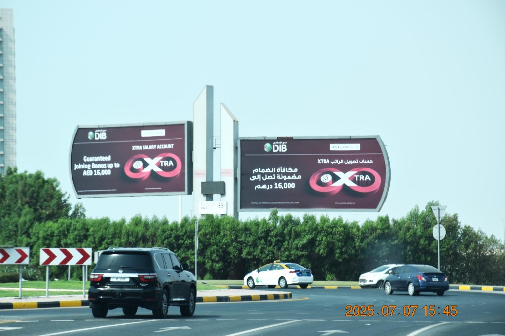
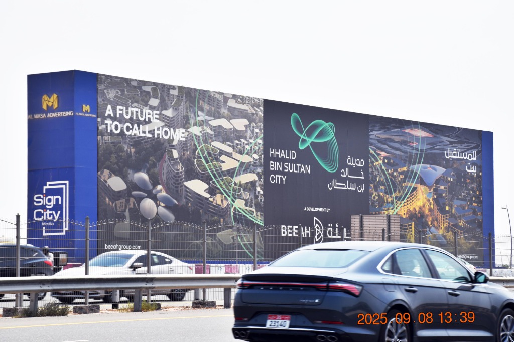
There is no such thing as an outdoor design standard. There is a design for a 1.2-metre lamppost panel read by a driver at 60 km/h, and a design for a 180-metre hoarding that nobody can see all at once. Treating those as the same brief is the most common and most expensive mistake in this medium.
Start with the three numbers that actually decide the layout
- The height of the face, not the width. Height sets the maximum type size, and therefore the reading distance.
- The speed of the reader. A pedestrian at a street panel has seconds. A driver on Sheikh Mohammed bin Zayed Road has about one.
- The number of passes. A commuter corridor gives you repeated exposure; an emirate border gives you one chance.
Everything else follows from those three.
The formats, and what each one will tolerate
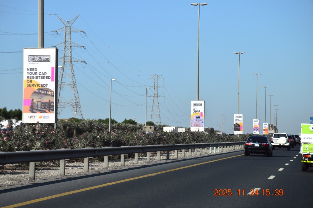
- Lamppost panels (1.2m x 2.4m, 1.5m x 3m, 1.5m x 3.5m). Vertical and small. A logo, three or four words, one colour field. The medium is the run, not the panel: twenty consecutive units deliver the message, so all twenty should be identical. Varying the artwork along a run destroys the effect.
- Muppi panels (1.3m x 1.9m). Pedestrian scale and close range. This is the one street format that tolerates a second line and a small amount of detail.
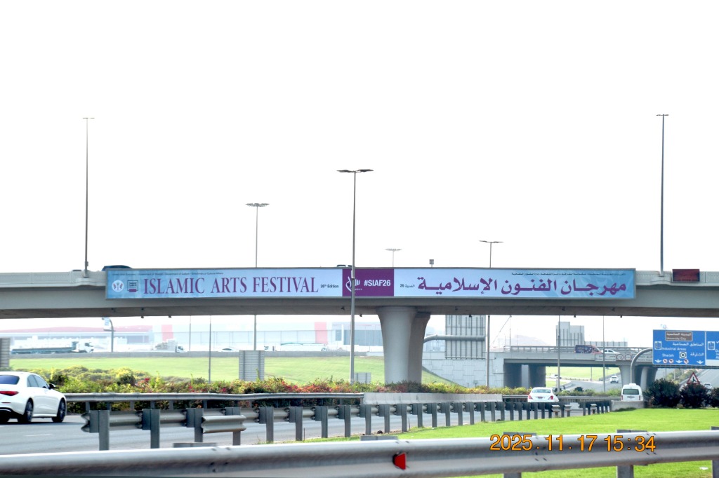
- Bridge banners (30-45m wide, often under 3m high). Extreme horizontal. One line. Logo at one end. Nothing stacked vertically, because there is no vertical space.
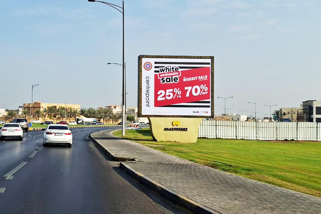
- Unipoles. Read at distance, usually double-sided. Big logo, short line, high contrast. Remember both faces can carry different artwork for different directions of travel.
- Hoardings (30m to 200m wide). The widest ones cannot be seen in a single glance, so design them to be read along their length rather than taken in at once. The eye travels; give it somewhere to arrive.
- Glass facades (up to 30m x 60m, some 19m x 80m). Vertical, on a building, seen from far away and from below. Verticality is the constraint: a horizontal logo lockup often has to be rebuilt for this format.
- LED screens. Motion, and a fixed slot length. Build for a ten-second read with the brand visible in the first second, not the last.
Contrast survives; subtlety does not
Outdoor faces are read in bright sun, through dusty air, at an angle, often at speed. Two practical consequences: contrast between text and background matters more than the exact brand colour, and mid-tones disappear. A design that looks refined on a screen at arm's length can be illegible at 200 metres. Check it by shrinking the artwork to thumbnail size; if it fails there, it fails on the road.
Back-lit and front-lit faces behave differently after dark, too. A colour that reads well in daylight can glow flat at night. Our large format print team can flag this before production rather than after.
Arabic is not a translation step
This is where UAE campaigns lose time and money, so it deserves its own rules:
- The layout mirrors. Arabic reads right to left, so the visual entry point moves to the right. A design built left to right and then flipped usually breaks.
- Arabic needs vertical room. Ascenders, descenders and diacritics need more height than Latin type at the same point size. On a bridge banner, where height is the binding constraint, this decides whether the line fits at all.
- Word count differs. A tight English line rarely lands in the same number of Arabic words. Write the Arabic as an original line with the same job, not as a literal rendering.
- Test both at final size. Not side by side on a monitor. At the real proportion.
Doing this at the start also shortens permit review, since the Arabic is examined as carefully as the English.
A short pre-flight check
- Can it be read in one second at thumbnail size?
- Is the brand identifiable without reading the text?
- Does it work at the exact dimensions of the booked face, not a generic ratio?
- Is the Arabic laid out as an original rather than a mirrored afterthought?
- Is there a phone number on it? Remove it, and give people a name they can search.
Every site we publish carries its exact dimensions and a photograph of the face as it is seen from the road. Design against those, not against a template: browse by emirate from Dubai, Sharjah or Ajman.