
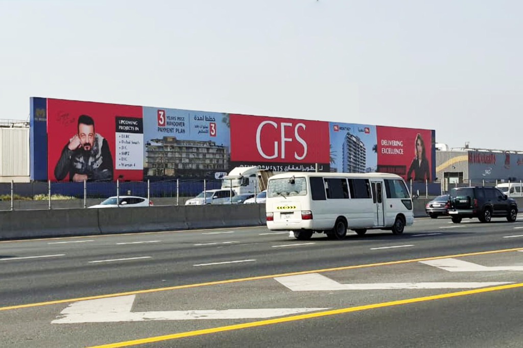
Sheikh Zayed Road billboard advertising works when you treat the road as a series of short moments rather than one big stage. A driver sees your message for a few seconds, usually while thinking about something else, so every decision about format, position and creative should serve that brief glance.
This guide is written for marketing managers who are looking at the corridor for the first time, or who have booked it before and want to choose more deliberately. It covers what makes the road different, which format suits which objective, how to brief creative that reads at speed, and the order in which a campaign is normally prepared.
Why Sheikh Zayed Road behaves differently from other roads
It is one of the busiest spines of Dubai’s road network, and it carries almost every kind of audience in one stream: commuters, delivery drivers, airport transfers, tourists and executives heading to meetings. That mix gives you broad exposure, but it also means you cannot assume the person in the car is your customer. The message has to work for a wide audience, or be sharp enough that the right people recognise themselves in it.
Direction and time of day change the picture. A stretch that is slow and congested in the morning rush gives people longer to read a board than the same stretch late at night, when traffic moves freely. One board can therefore play two different roles in a single day, and your creative should be judged against both.
The road is also framed by towers, signage and other advertisers. Your board competes with architecture as well as with its neighbours, which is why contrast and simplicity matter more here than on a quiet road with an empty horizon.
Which format fits which job on a major highway
The right format depends on what you want the road to do for your brand: announce something, remind people of it, or keep it in front of them for weeks. The table is a starting point for that conversation, not a rate card, and we confirm the availability of any particular site for each request.
| Format | What it does well | Think twice if |
|---|---|---|
| Hoarding | Wide, steady presence at the roadside; good for repeating a simple message | The creative needs a lot of copy |
| Unipole | A large face that can be seen from a long way off, so drivers have time to take it in | Your audience is on foot or on a side road |
| Megacom | Landmark scale for a launch or a brand statement | The campaign is short and tactical |
| Bridge banner | Sits directly in the driver’s line of sight over the carriageway | You need to change the message often |
| Building wrap or glass facade | Turns a tower beside the road into the message | The building owner’s approval timeline does not fit your launch date |
Many campaigns combine two of these. A megacom or unipole carries the headline, while hoardings further along the stretch repeat it, so the second sighting feels like recognition rather than a new message.
How to read a site before you book it
A site that looks excellent on a plan can disappoint in practice, so look at it the way a driver would. Go through these points on the road itself, not on a screen:
- Direction of travel. Which way does the face point, and which lane is the driver in when it first comes into view?
- Approach distance. How early can the board be seen, and does a bend, an exit ramp or a gantry interrupt the view?
- Background. A bright tower behind the structure can swallow a light-coloured design.
- Obstructions. Trees, road signs and high-sided vehicles in the next lane can hide a board for exactly the moment you need it.
- Light. Check the face at midday, at sunset and after dark. Glare and shadow change what colours can do.
- Speed at your hour. Slow traffic gives time to read; fast traffic rewards three words and a logo.
If you can, drive the stretch in both directions at the hour your audience is actually on the road. Ten minutes of that tells you more than most proposals do.
Creative that can be read in a few seconds
On a highway the creative has one job: be understood before the driver has passed it. That usually means one idea, a handful of words, a large logo and strong contrast between text and background.
Leave out anything the driver cannot act on. A long web address, a telephone number or a QR code is no use to someone behind the wheel, so give them a name they can remember and search later. If the campaign is bilingual, decide in advance how Arabic and English share the space and read each version at a distance before approving it; our piece on artwork and file preparation for billboard printing covers the technical side.
A useful test is to shrink the design to the size of a postage stamp and look at it from across the room. If you can still say what the brand is and what it wants, the design will hold up on the road.
From brief to installation: the usual order of work
A campaign on a major road is easiest when the steps happen in the right sequence. This is the order we normally follow:
- Set the objective and the audience. Awareness for a launch, a reminder for an existing offer, or directions to a venue each point to a different format.
- Shortlist stretches and formats. Use the table above and your own drive-through to cut the list down.
- Confirm availability and check the site. We verify what is open on the dates you want and look at the face together.
- Handle approvals. Rules and approval processes differ by authority, and in Dubai you should check with the relevant authority, such as the RTA, about anything on or beside a public road. For our own sites, Al Masa handles the approvals.
- Finalise artwork. The file is prepared to the exact face size and print specification of the chosen structure.
- Print and install. We print in-house and install with our own crews, scheduled with road safety in mind.
- Maintain through the campaign. Faces are checked during the booking, and damaged or faded vinyl is replaced rather than left up.
Common mistakes on busy corridors
- Putting a full product story on a board that is read in a glance.
- Choosing a site by how it looks on a map and never checking which direction it faces.
- Booking a single face and expecting it to cover the whole audience, when repetition along the route is what builds recall.
- Ignoring night-time: a design that depends on pale colours may fade into the sky after dark.
- Forgetting that a launch date and an approval timeline have to line up, so artwork gets rushed at the end.
- Treating the booking as finished once the vinyl is up, with nobody looking at the face again.
Questions we hear most often
Can we run a short, focused burst instead of a long booking?
That depends on the site, its existing bookings and the format. Some structures are sold in different periods than others, so tell us your dates and we will say what is realistic.
Do we need different artwork for each format?
Yes. Every structure has its own proportions, and a design that suits a wide hoarding will not simply stretch onto a bridge banner or a tall unipole face. The idea stays the same; the layout is rebuilt for each.
Is Sheikh Zayed Road the right choice for every brand?
Not always. If your customers live in a particular neighbourhood, a road that serves the whole city may be less efficient than one that serves them. Our Dubai locations page shows how we think about areas of the city, and the guide to hoarding, unipole and megacom formats helps you compare structures before you decide.
If you are weighing sites along the corridor, talk to Al Masa about your Sheikh Zayed Road campaign and we will tell you honestly which format and position suit your objective.